
TruePedal
Enhancing E-commerce
for a Bike Company
Project Overview
TruePedal is a company selling bicycles through its mobile-web platform. The company faced challenges with retaining users beyond initial product browsing and encouraging checkout conversions. After analysing user data and observing pain points in the browsing and checkout experience, I identified opportunities to enhance usability and streamline the purchase process.
Goal
To design a mobile-web experience that simplifies browsing and checkout, helping users make informed decisions and complete purchases with ease.
Impact
Improves customer satisfaction and increases revenue by providing an intuitive and seamless shopping experience for cycling enthusiasts.
Problem
Data provided by the Product Manager revealed two significant issues:
-
Browsing experience: 50% of users visited an average of 7 item pages but abandoned the site without adding any items to their cart. The hypothesis was users struggled to compare products and to identify the best bike for their needs.
-
Checkout process: 70% of users who placed an item in the cart abandoned the process at the registration page, as creating an account was mandatory for completing a purchase.
The target users were high-income earners aged 24-38, with 72% identifying as male. These users took cycling seriously, conducted thorough research before buying, and were particular about their choices. Addressing these pain points was crucial to improving the overall experience and driving sales.
Solution
TruePedal’s redesign aimed to:
-
Introduce a comparison feature to help user decision-making.
-
Implement a guest checkout option that captured user emails without requiring account creation.
-
Streamline the checkout stages and improve overall usability.
My Roles and Responsibilities
As the UX/UI Designer, I led the project from research to high-fidelity prototyping. My responsibilities included:
-
Conducting user research and competitive analysis.
-
Designing user flows, wireframes, and high-fidelity mock-ups.
-
Creating a cohesive style guide and branding.
-
Conducting usability testing and iterating based on feedback.
Tools: Sketch, Miro, InVision, Marvel, Google Workspace
Process
Research
To understand user needs and industry trends, I conducted:
-
Secondary research, gathering data on user behaviours and pain points.
-
Competitive analysis, by examining features, functions, and design elements from competitors like Amazon, Target, and Trekbikes.com.
-
User interviews, where I identified key barriers to completing purchases, such as confusion over product features and frustration with the mandatory registration process.
Competitive Analysis: Amazon

Competitive Analysis: Target
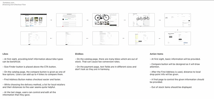
Competitive Analysis: Trekbikes.com
User Flows and Wireframes
I mapped out user flows to visualize the journey from product browsing to checkout. This enabled the creation of wireframes which were designed with the following goals:
-
To highlight product comparisons for informed decision-making.
-
To streamline the checkout process with a clear guest checkout option.


Branding and Style Guide
Creating a consistent visual identity was crucial for building trust and enhancing user experience. The brand name “TruePedal” was chosen to reflect the company’s passion for cycling and commitment to quality.
The style guide included:
-
A colour palette that conveyed energy and reliability
-
Clean, readable typography
-
Simple and intuitive iconography

Style Guide

TruePedal Logo
High-Fidelity Mock-ups and Usability Testing
High-fidelity prototypes were created to bring the designs to life. I conducted usability tests with five participants to gather feedback on the redesigned experience.


High Fidelity Mock-ups before the first usability testing
Key Feedback and Iterations
-
Users appreciated the compare feature, describing it as “smooth” and “effective.”
-
A participant suggested changing the progress bar colour during checkout for better contrast. Implementing this feedback improved visual clarity.
-
Adding an environmental message on the confirmation page resonated with users and aligned with the brand’s values.
Impact
TruePedal’s redesign lead to:
-
Increased user engagement with the app through the introduction of the product comparison feature
-
Higher conversion rates due to the streamlined guest checkout process
-
Enhanced brand perception through thoughtful design and messaging
Lessons Learned
This project provided valuable insights into e-commerce UX design, including:
-
The importance of simplifying complex processes to improve user retention
-
The value of iterative testing and feedback in refining designs
-
How emotional design elements can enhance user satisfaction and loyalty
Working on TruePedal reinforced my belief in the power of user-centred design to create impactful and effective digital solutions.
